Editorial 7: Bukowsky Publication

As with many of the other editorial pieces I have researched, I like the theme of monochrome with one chosen colour and here I think the yellow works well. The expressive typographic use of the bullet hole in the place of the ‘o’ is effective in portraying the harshness and brutality of Charles Bukowsky’s words and poems, as well as an onomatopoeic aspect in the sound of the ‘ow’ syllable of his name. On the left hand page, I like the neatness and symmetry of the page, with one main paragraph at the top and the body text split into two columns at the bottom of the page, divided by a greyscale image with a centred caption.

magazine-design-3

Editorial 6: “Cultural Arts” by Democrat and Chronicle

Despite this image being a cover of a publication and not a double page spread, I was drawn in by the interactive imagery and typography. These two elements working harmoniously together creates for an engaging graphic. The arrangement of the letters that spell “Cultural Arts” interacting with the dancer eludes to a sense of rhythm, which the editors believe is relevant to the topic being discussed”.

Screen Shot 2016-04-05 at 23.11.40

Editorial 5: Graphic Magazine Edition 10-11

The aspect I most enjoy about this spread is the large and playful title. The play on the words “curiously” and “seriously” make for an interesting layout, spreading across both pages. I like the use of negative space, and the contrast between the white unprinted space on the page and the dark, dense photo and large text.

Screen Shot 2016-04-08 at 22.44.10.png

Editorial 4: Komma 13

The topic of the latest edition of the magazine, komma 13, is “Outrage”: Outrage about the current state of the design scene. Skilled Designers often earn less money than supermarket workers. How has this condition evolved and why does nobody do anything against this? As the new generation of Designers, we find it very important to deal with this subject in order to create a better future. In summary, it is about us creating a more just work environment.”

komma-1.jpg

I was drawn to this editorial project because of the choice to print on red paper instead of white. I also love that each edition has a theme, and the theme of “outrage” fits perfectly with the artistic choices on every page. As with the Thomas Edison publication I recently wrote about, I love the aesthetic of hand written text, and I enjoy the chaotic and unplanned appearance of this page.


Editorial 2: Thomas Edison

This publication about Thomas Edison and the War of the Currents” was published in February 2014. I was drawn to it because of its colour scheme, use of multiple typefaces and experimental layout.

thomas-edison-1thomas-edison-2

These pages seem to not follow any kind of grid system, or, if they do, an intricate one. Despite this, I admire the faint grid that covers the paper in various levels of visibility, giving the illusion of grid systems and grid paper. I am intrigued by the band of yellow that lines each page at one edge of another and the complete lack of symmetry. I particularly like the range of typefaces used for each aspect of text, as I feel this adds voice and personality. A particular interest of mine is including hand drawn elements to digital work, and I am drawn to the aesthetic of the words “PATENTS” “MONEY” ELECTROCUTION” and “GOODBYE TOPSY”, that look as though they have been drawn or painted, thought they may not have been. For me, this publication is experimental and contemporary, pushing the boundaries of what an editorial publication should look like and include.

First Things First: Changes and Reflection

After receiving feedback from David on my First Things First project, I have made changes to my poster and web banner and feel much happier with them now. The overall look was very dark and dull, so I lightened the overall look. My subtext paragraph did not completely relate to the overall message of my poster, and so I believe I have changed this suitably. I added a subheading and played around some more with hierarchy, colour and font styles.

The subtext reads:

“So here’s the thing, design is everywhere. It is so everywhere that the registration of it’s presence becomes subliminal, often leading to an under appreciation of the hard work that went into it’s creation. But that’s okay. As designers, we need to step out of the shadows, grasp our work tightly in our hands and throw it out into the world, proudly shouting “I created this, for all of you!” Because that’s the reality. The reality we created, and are still creating. Designers create all that surrounds us: trends, society, reality.”

I feel much happier this these final designs. These are much more eye-catching and pleasant to look at than the previous designs I had submit and feel they would be much more successful as designs in the real world and for the purpose for which I was create. I really enjoyed this project overall, and I found it enjoyable to design for a purpose that I feel incredibly passionate about. I feel it was very helpful to begin with the First Things First manifesto, as this gave me a starting point and something to contextualise my work and refer back to in times of mental block. It also drew my attention outside of university, as an aspiring designer and I feel as though it was an important and pivotal thing for me to read at this point in my life, despite the fact it is aimed at practising designers who may have lost sight of what is the most important thing when it comes to your career. It has opened my mind to the reality that almost everybody needs design, and everything is design. For this reason, it is an incredibly important practise and we as designers are needed to make modern society work. However, the necessity of our craft can leave us under appreciated, taken advantage of, and creating the most trivial and underwhelming work. Design is a key element of education, information, projection of ideas and social change. It is important to keep in mind what is important and how I can use what I know to teach, educated, help those who need it and send out positive messages. Though I already feel that I know the weight of having no money, happiness should motivate your work.

Constellation: Sex Sells

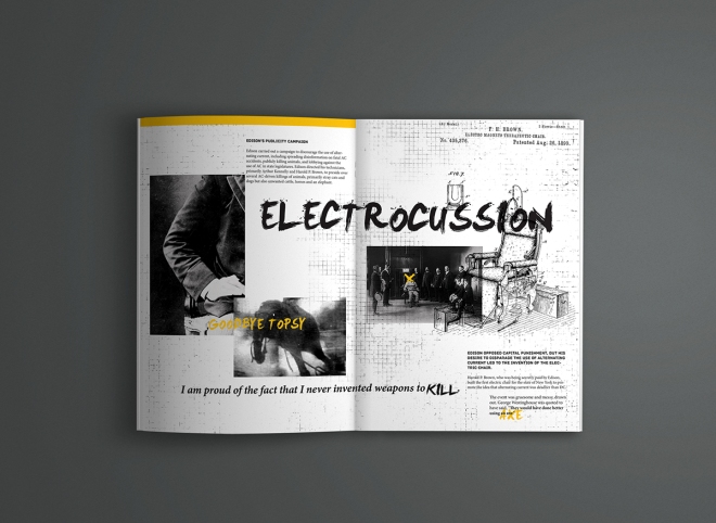
It cannot be denied that using sexualising products and people in advertising campaigns usually means more sales. During this lecture, but also during everyday life, I have experienced sexualised posters and adverts which almost become uncomfortable to watch for discomfort, appearing inappropriate for public distribution or television broadcast. Often, models and the female form are victims of sexual objectification in the favour of selling products or clothes. Time and time again, we see instrumentality, fungibility, violability, denial of subjectivity and dehumanisation of women who are treated as a tool for the sexual gratification of men. They are reduced to a body whose experiences and feelings do not matter. Immanuel Kant believed that “humanity is special and represents inner worth”, and so the act of doing this removes humanity and strips a person of what it is that makes them human.

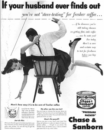
This has been ongoing for many years. In an advertisement for Chase and Sanborn coffee, and advertisement inferred that you would be physically punished by your husband if he ever found out about your coffee drinking habits. This advert is shocking to me, and almost seems as if it was made to be a joke. The reality is that this was an advert for coffee, and it was believed that a husband had ownership over his wife. The woman here is shown to be badly behaved, needing to be punished.

if-your-husband-finds-out.jpg

Some more recent advertisement campaigns where it is clear that sexual objectification and the dehumanisation of woman is being utilised are as follows:

In 2007, Dolce & Gabbana released this advert for their clothing range. It sparked questions about the insinuations of gang rape, as the model appears to be restrained on the floor with a male model in between her legs while others watch intently. It seems clear to me that the focus is not on the clothes, and while the male models also look very shiny and nice to look at, I cannot help feeling that the woman is in a place of vulnerability, being taken advantage of. I cannot understand why a brand with a reputation like D&G would want to output work with ambiguous meanings, such as this one, when some of the obvious assumptions about the image are so incredibly unlawful, immoral and wrong.

dolce-and-gabbana

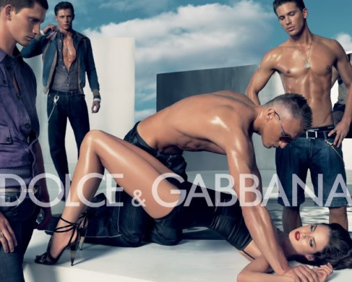
The campaign was later banned in Spain and Italy. According to the Advertising Self-Discipline Institute (IAP), who banned it:

‘The advertisement showing a woman pinned to the ground by the wrists by a bare-chested man, with other men in the background looking on, has been banned since yesterday.

The advertisement ‘offended the dignity of the woman, in the sense that the feminine figure is shown in a degrading manner’.

‘The woman has an alienated expression, with an absent look.’

The woman is ‘immobilised and subjected to a man’s will’.

It is banned because of ‘the passive and helpless position of the woman relative to the men around her, and the representation of abuse or the idea of violence towards her.’

(http://metro.co.uk/2015/03/18/dolce-gabbana-in-hot-water-again-after-gang-rape-ad-campaign-resurfaces-just-days-after-ivf-furore-5108624/)

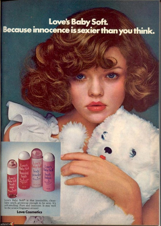
Another advertisement I found particularly shocking was this one from ‘Love’s Baby Soft’ in 1975. I find this one extremely uncomfortable and cannot believe that this was an actual campaign for the company. The model featured in the advertisement looks painfully young. Her tight curls and the teddy bear she is clutching give ideas that she is only a child, but the make up on her face suggest she is being made to be older than she is. The tag line is, above all, what makes this piece so unbelievable. The use of the words ‘innocence’ and ‘sexier’ in the same sentence in this way is difficult to fathom. The idea that someone gave permission for this advertisement to be distributed, ambiguously suggesting the sexualisation of children and innocent members of society is crazy and something which definitely would not happen in this day and age.

loves-baby-soft.jpg

This lecture felt very relevant for me as advertisement could be the career I venture into after university. It is important to know your audience and what is suitable and what is inappropriate to expose them to. I also think it is important to be gentle towards sensitive issues, and know the difference between creating something that will draw attention and creating something that will stir outrage. Graphic communication is about pushing boundaries in order to stay relevant, however it is abundantly clear in some cases I was shown in this lecture that some designers unfortunately blurred the line of what is an innovative advertisement and what is unacceptable for public distribution.

First Things First: Web Banner

For the second part of the project, I had to create an alternative platform to promote my idea. I decided that, as the most fast and accessible platform of today, a web banner would be most appropriate for distributing my message, especially as it is aimed at graphic communicators who are so often stereotyped as computer whizzes.

I experimented with different web banners in both portrait and landscape formats. I formed what began as the main visual on the banner, a rearranged version of my main poster phrase. I was not happy with this and wanted to make my web banner different to my poster, whilst still following the same theme. I then developed a formation of the words of the main phrase on my poster, to feature on my web banner so that it is clear that both platforms are of the same project. I also used exactly the same colour theme. I decided to take the most dynamic and important phrases from my small contextual paragraph and use those as the main attraction on the web banner, using the same fronts and colours from the phrase on the poster. After originally designing landscape web banners, I decided to experiment with portrait web banners and decided this worked best.

This is my final web banner:

WEB-BANNER